Around two months ago I received a Nokia Lumia 920. Having been a long time iPhone user (3G and 4), I decided it’s time to give another phone a try. After having used it for over a month, I’m back to my iPhone (my switch to Android lasted 8 months).
This post is about the overall experience with the phone. It is not about pointing fingers. From a user’s perspective, I don’t care if it’s a Nokia issue, an Operator one, Microsoft’s, Windows Phone Team or last but not least, App developers. I’m describing my experience as a user.
I also realise that many people might have a completely different experience to mine, and that’s fine. It might be I’m too picky or just have bad luck with electronics (does happen). Having said that, let’s move on.
Disclaimer: Maybe some of the issues I point out in this post are user error or sheer ignorance. If they are, please enlighten me. I’ve still not decided 100% if I’m going to stay with iPhone or switch back.
The Hardware
The device itself is actually very nice. It’s a slick, thin design and despite it’s dimensions, it does not feel uncomfortable to hold and have in your pocket. As Dan North says, it’s the thinness that matters, and I tend to agree. It has a nice screen size and having an external button to activate the camera and take shots feels very comfortable and natural. The camera itself is fantastic. Great quality video and pictures.
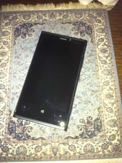
My device is a Developer edition, so it didn’t come with any charger other than an extremely short USB cable. Not much more to comment on the hardware, other than there was no headset. Not sure if the retail version comes with a decent one which includes a controller much like the iPhone. It is definitely something I missed having.
Volume Control
The downside of the hardware is not having a Vibrate/Mute button like the iPhone does. In addition, placing the phone on Vibrate requires 3 operations: Press the lock button, press the Volume down or up button and then click on an icon to toggle between Vibrate or Ring. As someone with a 10 month old baby or having to use the Vibrate button quite frequently “on the job”, this can be cumbersome.

What is however much more annoying is that there is no separation of media from ring volume. If you want to hear the phone, you’re going to pop your ears out listening to music. There is only a single volume level which applies to Video, Audio, Notifications and Ringer. Honestly I don’t know why they’ve not thought of this.
The Keyboard
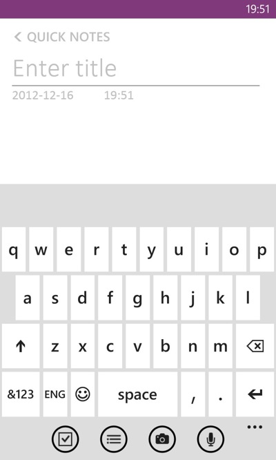
Initially the keyboard seemed fine. I was able to type, except for one,minor,issue,and,that,is,that,I,kept,pressing,the,comma,key,instead,of,the,spacebar. No matter how much I try, I can’t avoid it, to the point that lately I was avoiding using my right thumb to hit the space bar. Maybe I have a thick thumb. Don’t know. Other than that though, no real issues in key spacing or other.
Spellchecker
Try and type Hell on the iPhone and you’ll always end up with He’ll. Can be annoying. I was somewhat relieved initially that this wasn’t the case with this phone. What it does offer is word completion. If it feels you’re writing a word incorrectly, often the first word on the autocomplete list is in bold, meaning that it will automatically replace the word you’re typing. It claims that it learns from your typing and offers suggestions based on it.
To be honest, I’m not sure how well this works. It doesn’t seem to offer a lot of autocorrect suggestions, and some that I’d really like it to offer, it does not. For instance, on the iPhone, every time you type i, it will interpret it as I. When I type Ill, it will replace it with I’ll. Not here. You type i, you have to explicitly correct with I. Same with Ill. Dear Windows Phone team, there is rarely ever a time when I type i and not mean I.
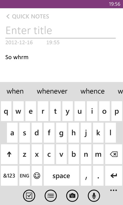
The upsides to the spell checker not being over protective is that it doesn’t autocorrect too often, which I find can be useful when alternating between two languages (in my case English / Spanish) and not having to constantly switch keyboard layout. In addition, sometimes (I’ve still to figure out when), a + sign appears next to a suggestion, allowing you to add it to the dictionary.
Form Navigation
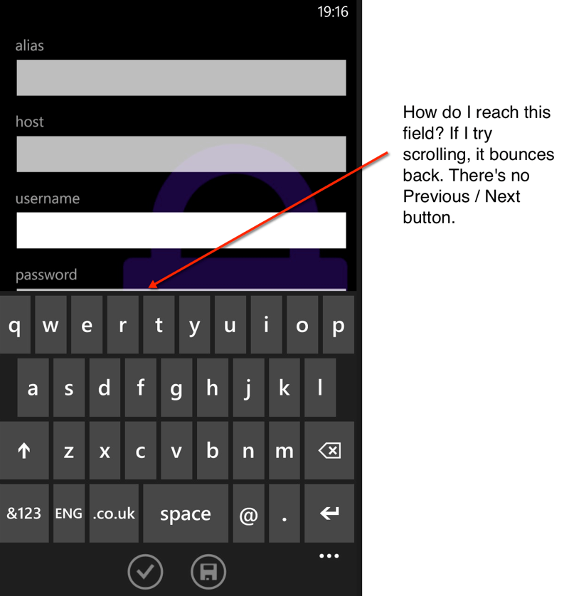
This one is really a fail in terms of usability, or I’m doing something completely wrong. While filing in a form on the browser, on the iPhone, you are normally provided with two additional buttons right on top of the keyboard: Next, Prev allowing you to easily navigate to the next or previous field. On WP8 you don’t get that. And this can be really problematic since as the keyboard overlaps half the screen, you often cannot click on the next field to move fields. In fact, this problem occurs on native applications also. Sometimes I honestly don’t know how to navigate back and forth between fields.
Battery Life
Used extensively, the battery lasts me around a day. That is when I don’t get the sudden death feature, whereby the indicator displays half-charge and the phone just dies on me.
Links and Discoverability
Most applications use regular text as action items, not buttons. The problem is that there’s nothing that differentiates a link from regular text on the screen. And while often an action is apparent, many times I find myself clicking on different text items wondering if something’s going to happen. Of course, this isn’t aided by the fact that some application designers think it’s good to hide actions under pictures or avatars et al (Skype comes to mind). Not the most discoverable interface at times.
Live Tiles
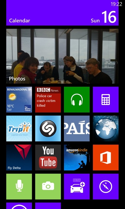
One of the main features of the Windows Phone and a big selling point are Live Tiles. And they are fantastic. Of course, after the first couple of days, when the new factor wears off, you’re left with the annoyances of caching issues, by which I mean tiles not refreshing accordingly. I’ve had this occur with WhatsApp among other applications. While not getting the latest headlines on a live tile isn’t detrimental, missing out on messages does put you in an compromising social position whereby you now have to explain that you really weren’t ignoring people.
I think that the Live Tiles have a lot of potential, but unfortunately many applications don’t take much advantage of them. Also, applications don’t offer much in terms of customisation. For instance, with Skype, it displays on the tile the number of notifications and you cannot switch it off. The only way to do so is to remove the tile from the main screen.
People Hubs
Another central feature of the phone are Hubs, the idea that you connect different aspects of a person into one central place. For instance I have a live tile for my wife. I link Skype, Cell number, SMS et al all under her contact. Idea is that everything is now displayed on that tile. Fantastic. Unfortunately, at least for me, not everything works. I only manage to see SMS’s and phone calls under the tile. Not sure if this is a Live Tile cache problem again, or a lack of proper implementation from the intervening apps, but ultimately, it doesn’t work as expected.
In any case, even if this were to work correctly, I’m not sure that I’d want anyone other than my wife on the front screen in a tile. I honestly don’t picture my colleagues or other people representing an icon on the screen. There is the concept of creating a group of people and having them in a tile, but again, that seems to suffer from the same issues as a single person.
Having these people hubs also does away with some common features we’re used to in other phones, namely favourites. For instance, when clicking on the Phone application, there’s no Favourites. On Windows Phone it’s hubs. You want favourites, create a hub and link contacts up.
The Apps and the Store
When I first received the phone, I immediately tried to install all the apps I had on the iPhone. To my surprise, Skype wasn’t available, which is quite disappointing considering that Skype now belongs to Microsoft. It did arrive several weeks later and to be honest, except for the live tile issue, the overall experience with it is good. However, other apps are quite disappointing: 1Password crashed (apparently now it’s fixed but still doesn’t work for me). WhatApps has issues of not receiving messages and/or updating the live tile. Viber doesn’t offer voice, only messages. In addition, the overall choice of applications is not that great. Yes, if you want RSS readers or background images, there are plenty.
When it comes to the actual quality of the applications, not too impressive.A lot of crashes, a lot of hangs, some awful user experiences. This is somewhat unfortunate since the ecosystem contributes significantly to the success of the device.
One feature I do like is the ability to search for an application and install it from the store without explicitly going to the store. When launching an application you can search for it by using the Search feature. If it doesn’t find any matches, it provides you the option to search the store. Installing applications from the store is straightforward. I’ve actually not bought any applications so cant’ comment on the payment experience.
The Hangs
Apart from random application crashes (specially Twitter), I’ve had several hangs of the phone, causing me to switch it on and off. Others don’t seem to suffer this problem, so it might be just me (again).
The mail application is OK, nothing special or any feature that really stands out. Gmail works fine, and I could sync my account, including contacts and calendar successfully. However, that’s going to change.
Tap and Send
Apparently the phone has a Tap and Send feature where you can get close (or Tap?) another phone to share information. Unfortunately I’ve not experienced this myself since I haven’t found anyone I can tap (the phone) with. NFC also provides wireless charging, but again, not experienced it personally.
Music
Nothing really stands out when it comes to the Music application. It’s quite decent, with album view, quick play, etc. However, one feature that is lacking is the ability to create playlists directly from the phone. This sucks, specially when you’re on the road, on a plane, on a train, when you actually have time to sit, listen, create a list.
Connectivity
When it comes to Internet Sharing, very easy. Switch it on and you have a WAP. One nice feature is that it automatically switches off the sharing if nobody is connected after a couple of minutes. Had no issues connecting via PC or Apple.
Can’t say the same about BlueTooth. For the life of me I couldn’t get it to work with my car. I’ve had no issues with two iPhones or two Androids, but Windows Phone doesn’t seem to like Toyota Auris. Additionally, the USB outlet of my car also isn’t apparently powerful enough to charge the phone.
For Data, the phone provides 3G and H+ and both work fine. I did have to explicitly set up the configuration for my telephone operator in Spain (Movistar) and much like the anything other than iPhone, hooking on to Movistar WiFi zones requires sending an SMS and getting a password. This is an operator issue I’m assuming, but again, the overall experience is not as smooth as with the iPhone / iPad whereby it automatically detects you and logs you on.
WiFi also seems to work OK except that every time the phone locks, it loses configuration for open WiFi’s that require you to log on via browser. Again, annoying.
Editing
The editing and positioning of the cursor is kind of strange in comparison to other phones. When positioning the cursor, you don’t get the magnifying glass. Instead you get a cursor offset from your actual finger’s position by about a couple of mm’s. You then move your finger around to position it. For a while I didn’t realize how this works, until finally I moved my hand further down to get the cursor back on screen. Somewhat strange, and on the fence about it. Copy/Paste operations I’ve found a tad cumbersome in some occasions, specially with autoselect (i.e. click on a link and it autoselects it).
Summary
I switched to the Windows Phone with an open mind and tried it out for over a month. I’m now back to the iPhone and one of the reasons is to see if I actually miss anything from the Windows Phone (while I thought I’d really miss out on the screen size, I haven’t that much). The one thing I do miss is the Home button actually working (yep I have this issue).
Of course, many of the issues I’ve highlighted might boil down to minor things that need ironing out, a few rough edges here and there you might say. The problem is however, that this is not the first generation of Windows Phone. And to enter a market that is already dominated by two major players, you not only have to disrupt it by offering something fantastic and new, but you also have to make sure it’s perfect. Unfortunately as it stands today, for me at least, Windows Phone 8 is neither.