Scott Hanselman had a post recently about shortcuts and web applications. Going through the list can be somewhat scary, specially if you using more than three or four of the applications listed: think about all the shortcuts you have to remember. Nightmare! Seriously, as humans, were we destined to have to remember hundreds of shortcuts? Isn’t there a better way to spend our time?
Now if you’re like me, a keyboard fanatic, you’ll probably say it is worthwhile, that it pays off in the long run, because the mouse, well it’s just not productive. In fact, the first thing I usually do when teaching a course on TDD or ReSharper is tell students to unplug the mouse. Why? Because the mouse just gets in the way. It makes you lose focus, it takes precious seconds away. Ultimately, the mouse breaks the flow.
Software developers and UI designers realized this as the graphical interface flourished. That is why the concept of keyboard shortcuts where introduced, to try and avoid menu and submenu navigation galore, specially on repetitive operations.
One size fits all fallacy
Keyboard shortcuts, easy to implement on desktop applications, were initially not so popular on the web. However, lately, it’s hard to find a decent web application (except that lame excuse for what Twitter calls an HTML application, a.k.a. the new Tweetdeck client) that do not have keyboard shortcut support.
And in principle, this might seem good. The problem however is that we have not only taken it too far, but we also seem to be committing the same mistake over and over again: trying to standardize behavior over devices and contexts.
Whether it’s the laziness of us, as developers, or the ambitious business orientated approach of re-use, we keep trying to apply same the thing in different places. We’ve seen the mistakes in hardware, such as trying to shrink Windows down to fit on a cigarette box (Windows Mobile), or the more recent approach of Microsoft, which is thinking that the Metro experience will be as pleasant on a desktop devices as it will on a touch-screen ones.
We’ve also seen this approach with software: think about all the different apps you are using that have Desktop and Mobile versions, where they try and offer the same experience. Does it always work? Why do we do it?
Forgetting the lazy developer or supposedly high ROI aspect, we also have this preconception that if a user learns how to use one interface, it will be easier. It maybe true, but I’d argue that if a user interface is simple and intuitive enough to not require a steep learning curve, it usually does not pose a problem. A homogenous design is not required to make things easier. It just means you’re used to the same errors.
Moving beyond devices and interfaces, we have the added misconception that all applications require the same type of interaction. It seems the general rule is that every application requires some icons and some keyboard shortcuts. That way, mouse-friendly-non-technical-savvy-users can be at ease with their pointing devices, be it a mouse, trackball or finger, and the hardcore users can be expert keyboard ninjas. But not every type of interaction for every application has to be the same.
Commands: When shortcuts don't make sense
If you’re old enough to experience buying a ticket at a travel agency, you’ll no doubt remember the agent whamming away at the keyboard trying to find a flight for you. Much like Scott mentions in his post, the airline industry still is a very keyboard heavy user-base. You hardly see any pointing devices lying around terminals at an airport. Many of these systems used commands, much like commands from the DOS or bash console:
- dir to list a directory
- mkdir to make a directory
- copy to copy a file
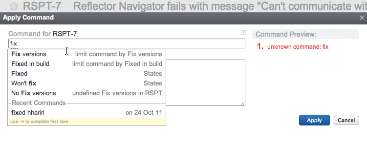
It worked well back then and it still works well today. A comment I left on Scott’s blog in reference to YouTrack which was listed there, was that although YouTrack has keyboard shortcuts, the main beauty of it is not having to remember these, but the ability to use commands. You see in YouTrack when you want to close a bug, you don’t have to remember a keyboard combination, you just start typing:
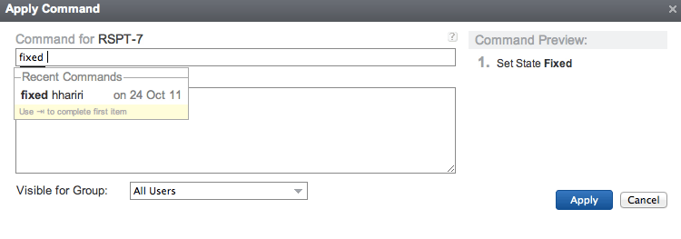
and as you type, YouTrack not only offers command completion, but also displays a list of recently applied commands. Once you type something coherent, it then tries to interpret your command:
It’s the same principle that was used in older systems, but brought up to date, to be less error-prone and more user-friendly. And of course, this works with any type of command, not only closing a bug.
Think about the interactions
A keyboard is not suitable for many scenarios. Imagine using a keyboard or using commands for drawing sketch diagrams or using AutoCad? We’ve been there, done that, and it wasn’t very nice. The ideal device for this type of interaction is a mouse or some other pointing device.
On the other hand, a keyboard is the perfect type of interaction for writing code, much like it is for writing a letter. Keyboard shortcuts are also great for these scenarios, where we do not want to lose focus.
Commands also have their place. When keyboards shortcuts are not viable, when focus is not about continous writing, yet we also do not want to be mouse-heavy, commands are a perfect fit.
What is important however to consider is that not all scenarios are equal. We seem to have somewhat learned this lesson by creating touch-specific applications, but we usually only take this into account when thinking about a device, more than thinking about the application. The actual purpose of the software is as important, in order to provide a productive and fluid user experience.
Even when the day comes where voice-controlled systems do improve, it won’t mean we need to apply it always.


